Hyper Text Markup Language or HTML is considered the standard language to structure a website and web content.
The language is highly creative, with added elements like audio and video support, providing better website interactivity.
Here is a list of ten such HTML websites that took advantage of this universal language to create innovative designs that make them stand out.
1. Decompressed Prism
Laura Piccolo designed the website, ‘Decompressed Prism’, to feature Salvatore Vitale’s artistic take on technology. 3D pictures and videos, step-by-step instructions to navigate the website, and an interactive interface, are what make this website stand out.
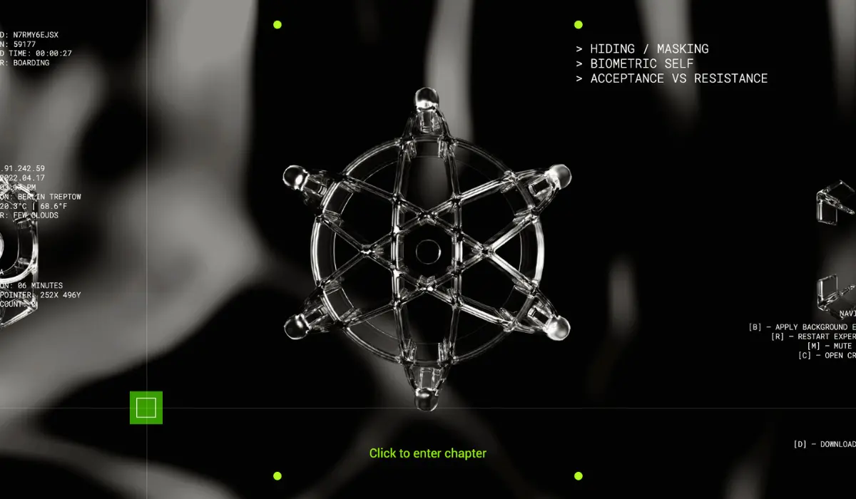
Salvatore Vitale’s work is a narration of the intersection of technology and philosophy, integrating various elements like video archives, documentaries, text, sound designs, and certain fictional elements to make his point.
Everything on the site is laid out in a way that directs the user toward the next step without confusion.
There is not a lot of dragging down or up, rather have ‘click on’ options where each section is represented with a 3D image.
The content is non-linear and can be navigated randomly from anywhere in the one-page format it is displayed in.
2. Intelligent Video Solutions
Intelligent Video Solutions is an instream video marketplace and video distribution platform that has an inventory of videos collected from clients belonging to different categories.

They offer services to publishers and broadcasters in video distribution while building a video marketplace for advertisers.
The marketplace is created with premium quality videos collected from the publishers and the broadcasters who trust the website to help them monetize their video content while reducing steaming costs and generating incremental revenue from it.
As for the advertisers, they can reap the benefits of a single point of access with increased audience engagement. The website integrates a video background, text, and graphics to enhance user experience.
3. Joshua’s World
As a talented interaction designer, the portfolio website created by Joshua is a glimpse into the extent of his creative skills.
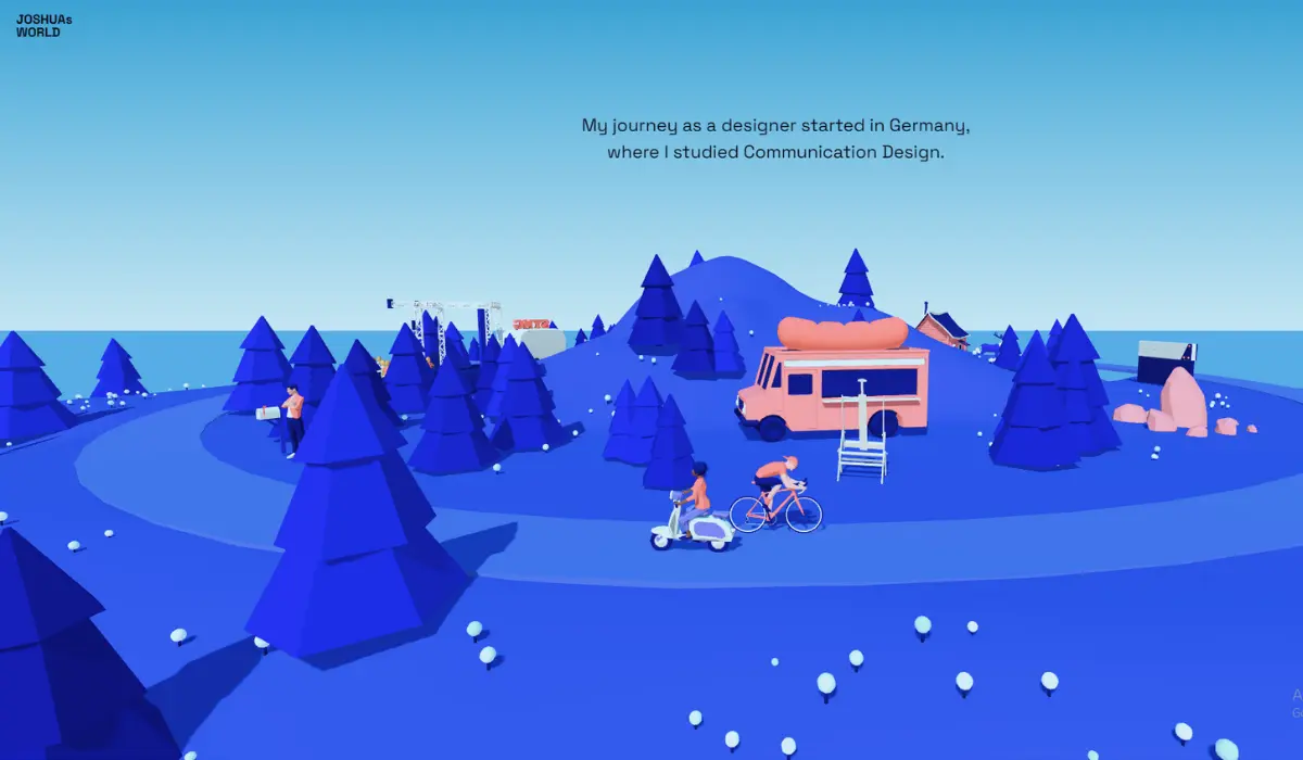
Unlike usual portfolios that represent the lists as thumbnails, Joshua’s world adopts a more engaging approach.
The user, once they enter the website, is represented as a bicycle rider who can travel back and forth to see every milestone in Joshua’s life, career, and academics, in either order.
Although the basic elements are built with HTML, the interactive elements are mostly Javascript. The visual element grabs the user’s attention, helping them connect better and retain the information they have learned while roaming around the portfolio.
The website is a good instance of how to leverage the power of the language to create something that speaks loudly and clearly to your target audience while showcasing your skills.
4. De Republeik
Featured with animated text and large, easy-to-read fonts, De Republeik is an interactive website that is designed to give a peek into what would it be like inside the establishment.
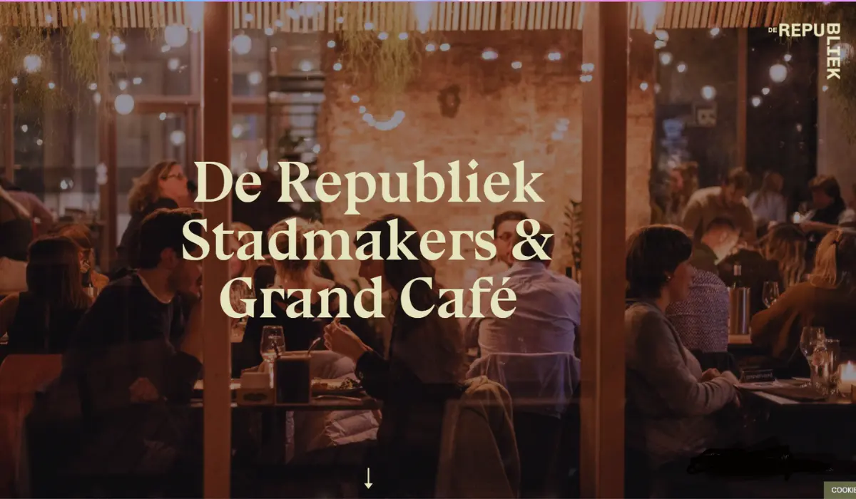
The place, in real, is a creative platform where a community of individuals come together to meet and experience Briuge’s food, art, and culture.
The website represents this space with utmost creativity, capturing its atmosphere beautifully. The page includes pictures of meetups and various events conducted at the location, giving a preview of the customer’s experience at the Grand Cafe.
The website also has banner-style web crawlers with brand statements, CTAs, and partnerships that add flair to it.
There is also an added option to navigate the site further for specific details which will be revealed once the visitor clicks the sticky ‘+’ button on the site.
5. 908 devices
A medical website based on HTML5, 908 devices is a platform that acts as a comprehensive resource hub created by Metropolis Creative, a company that specializes in chemical and biochemical analysis technology.
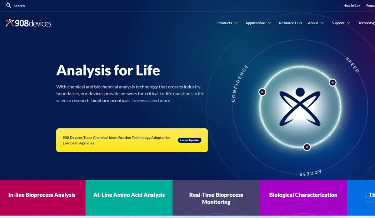
As the company develops medical devices that answer questions in life science research, pharma & biopharmaceuticals, forensics, and related fields, the website presents these solutions to visitors, providing public access to information.
The resource hub section of the website has a collection of case studies, device manuals, application notes, mission briefs, and so on that provides comprehensive access to all the data on the research they conduct.
The drop-down menu feature contains a preview of the content the website has and makes it easier for users to navigate through.
6. Understanding Neurodiversity
The website aims to educate people about neurodiversity, enabling them to see things from the perspective of neurodivergent people.
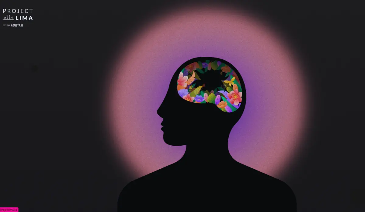
It is a part of Project Lima designed to create an awareness about how neurodivergent people operate in society along with busting certain myths regarding their behavior, intellect, and emotions.
The website is vibrant and represents the mentality and perspectives of a neurodivergent individual with accuracy.
It is designed in a way that directs the user toward the next step or skip it if they wish to. It is a combination of music, sound effects, visual texture, engaging narration, and illustration to convey the message in the best way possible.
The website has also used Scalable Vector Graphics, aiding in a smooth transition from screen to screen.
7. High Mountains
All about Italian mountains, High Mountains is a website written in HTML5, JavaScript, CSS, and PHP. The website showcases the beauty of the mountains, showcasing mountaineers’ latest excursions with pictures, videos, and interactive 3D maps.
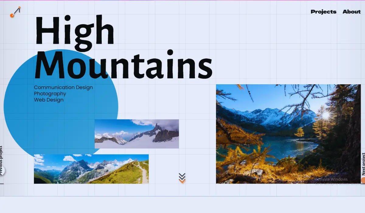
Andrea, the creator of the website shows off her skills in photography, web design, graphics, video making, and 3D tech all in one place with this website.
Her interest in all these areas and mountain hiking is what inspired her to be a part of this project about Italian mountains and ended up creating a vibrant website that portrays the essence of it.
The pages are linked together with suggestions, and this makes it easy to navigate through the whole website.
The 3D map displayed on the site virtually guides you through these mountain peaks, making you fall in love with them.
8. Earth Eclipsed
A website with a unique player interface, Earth Eclipsed is a podcast that makes use of the audio element of HTML5.
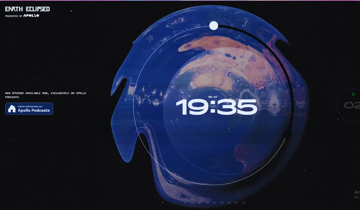
The visitors can play the episodes one by one with a click on the episode numbers displayed inside a circle. The currently playing episode will be dragged into the center, on a rippling image of the earth in a dark background, with a countdown on the side.
The website also features several other interesting graphics and video clips, including a clip of all podcast team members clapping.
The podcast explores various themes including data privacy and freedom & order, providing an understanding of human nature.
The journey through this website and the whole podcast will be an exciting and thought-provoking one, experiencing a universe outside your perception.
9. Take A Ride with Me
Take A Ride with Me by Nikolaj Juhlsen is a website written solely in HTML5. The homepage has a play button that follows your cursor everywhere it goes, creating a playful environment.
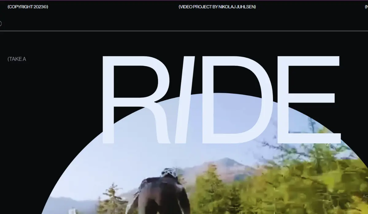
Once you click play, you will be taken to the next page with a live streaming of mountain biking. You will be put on the bike seat, experiencing the journey through your desktop, with the same curiosity and excitement of the original biker.
The journey the website takes you on is as close as a live experience that you can get through a desktop screen. You will be taken on treacherous trails in the European mountains, anticipating a twist at every turn.
10. Pencilvania
A project by Stutpak and Luuk, built with data collected from the RescueGroup Organization, Pennsylvania is a platform that displays the latest dogs put up for adoption in Canada and the US.
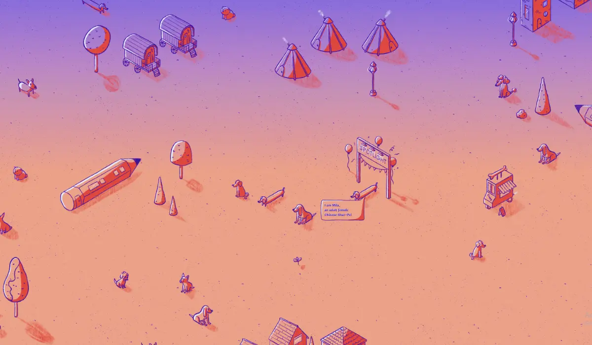
The website is updated four times a day, adding new members to the group, and closes at 6 in the evening.
To navigate, you need to click and drag through the town and will be able to watch a new dog taking the spotlight every time.
On clicking on the dogs shown, the site will display more information on them, leading the visitor to adopt one of them.
Each time a dog is adopted, there will be a cute bark sound, expressing their joy. The whole site, including the audio effects, is built on HTML5, showcasing the creativity of the owner.
All the HTML5 sites listed above are unique in their design, the subject matter they display, the way they interact with the visitors, and the messages they convey.
All of them have dynamic and vibrant designs that go with the main topic. The features other than the color palette and animation, like 3D maps and audio elements are incorporated beautifully and wherever necessary, adding to the appeal of the whole website, and enhancing the customer experience.
Conclusion
As we have seen, HTML5 can be used to create projects of all kinds, from personal websites to business websites, blogs, and portfolios.
A skilled individual can get extremely creative with the language, creating the best-looking and functional websites that do the work.
Joshua’s World is an instance of this, that took a simple concept and made the best out of it. The language helps you think outside the box, turning you into a creator capable of transforming your ideas into their best forms with less effort.
